Gratangen municipal
Foreword
To captivate the interest of people whose attention is consistently divided among various organizations, events, and sophisticated marketing ventures, also libraries have adeptly embraced well-structured and strategically designed identities. These efforts aim to engage a wider audience, enticing them to explore the enriching cultural and communal services that libraries provide.
Although in a small municipality like Gratangen, the aforementioned might not be as necessary, given the limited number of events taking place. Nevertheless, it could still help direct more attention to the library while concurrently enhancing the representation of the Gratangen municipality, whether viewed by local residents or observers across the country and around the world.
For illustrative examples, please refer to the logos from different Norwegian libraries showcased bellow.
Other examples


The logo proposal
The logo proposal

Explanations
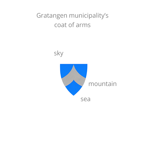

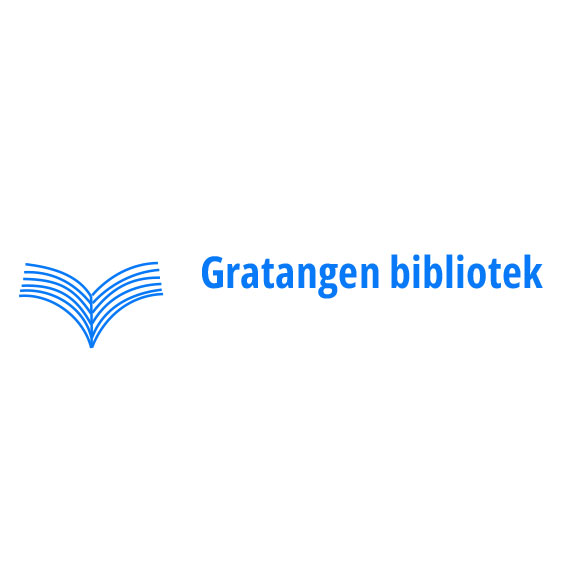
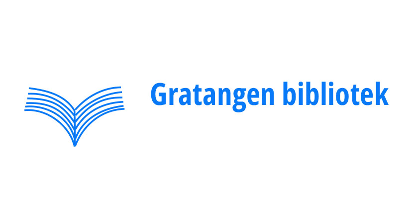
The connection to Gratangen municipality’s identity is embodied by the book symbol, which is, in fact, a rotated portrayal of mountain derived from the municipal coat of arms. Additionally, the color blue corresponds with the background hue to further underscore the relationship.
To emphasize the inherent organic qualities of paper and create a connection between the symbol and the organization, the library’s emblem is hand-drawn with slight irregularities. This artistic decision might also resonate seamlessly with the primary school where the public library is located, appreciated by both children and teachers, without appearing overly formal.
The library’s identity can indeed evoke an affiliation with Gratangen Municipality at first glance, establishing a harmonious link between the public service, municipality and its coastal culture.
Logo applied
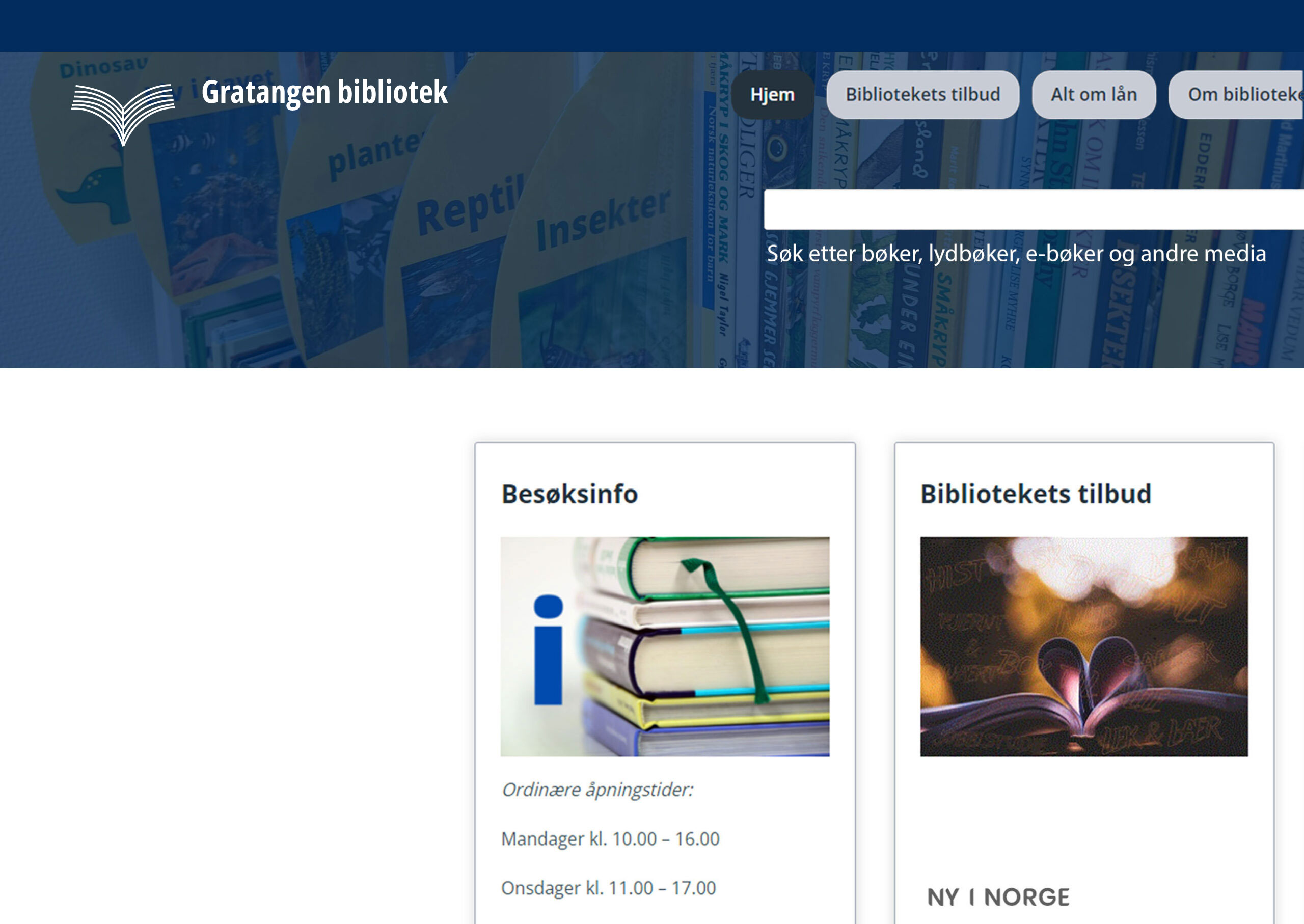
on webiste
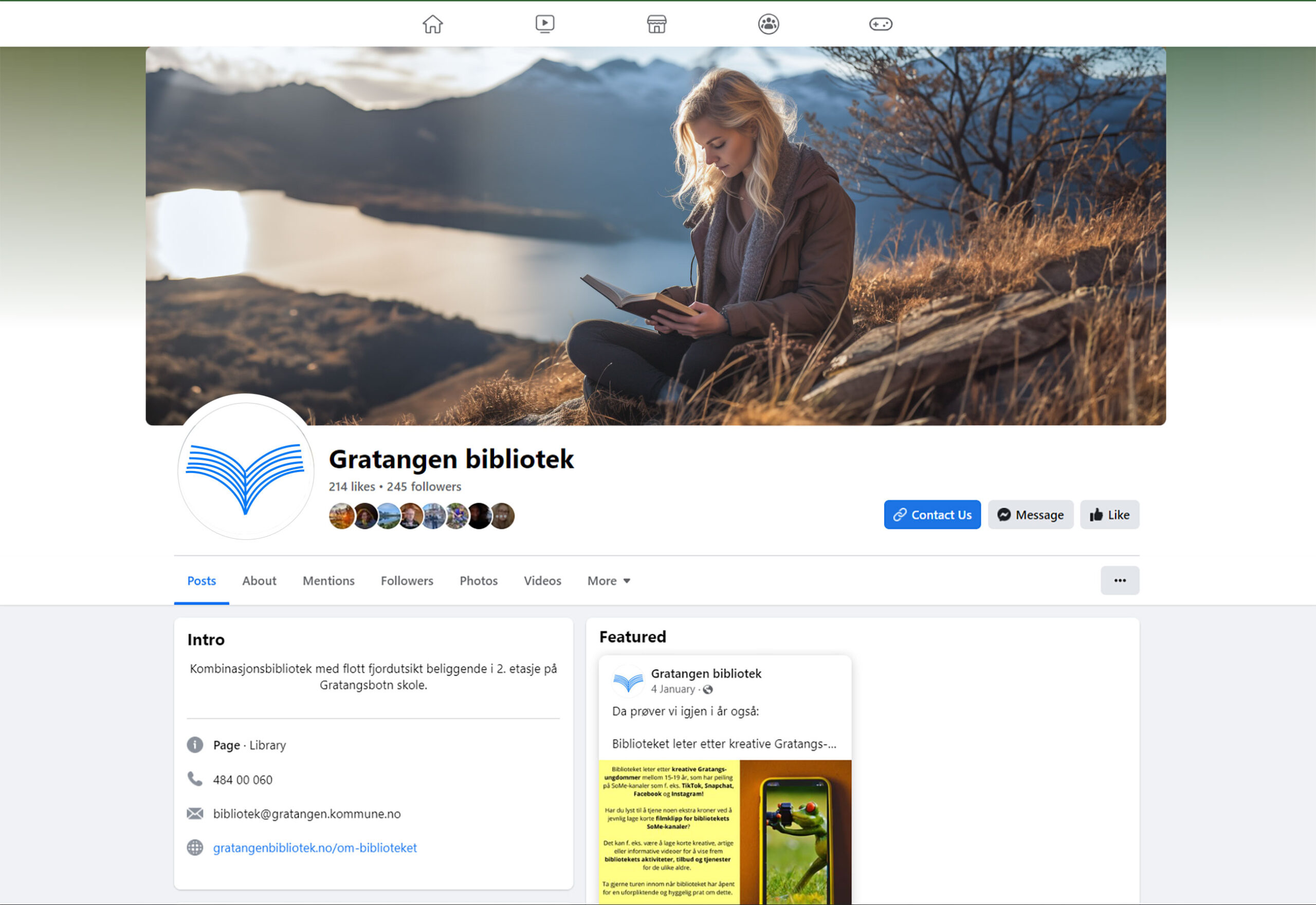
on social media
Conclusion
I recommend retaining the Gratangen coat of arms as the symbol for the municipality’s administration, while allowing the library to establish its own distinct identity. As a result, it would be prudent to remove the coat of arms from the library’s website and replace it with the newly designed logo as depicted above. This ensures that the library isn’t mistaken for the municipality’s administration. Furthermore, there is an inconsistency in the library’s branding since it uses a different logo on its social media, which is its primary mode of communication with the public. This inconsistency might distort the library’s image, especially in the eyes of outsiders, potentially tarnishing the reputation of the municipality as a whole, as this practice is widely perceived as unprofessional. However, maintaining a visual connection between the library and the municipality could be beneficial. Such a connection, as suggested in the proposal, should be consistently reflected in other forms of communication.
The development of the logo was guided by input and consultations with the library’s manager, Méline.
Please share the logo proposal along with the web page link above with your colleagues and others who might be interested. This proposal could be offered as a donation to the municipality to enhance both the library’s and the municipality’s profiles.
I look forward to hearing from you.
With kind regards
Jozef
Communication Design Studio
[email protected]
98 67 85 01